
How I designed user engagement app v1
Led a full migration to shared components and tokens to improve consistency across the product.
Overview
Initial Problem:
It all started with a significant hiccup: the old system relied solely on sending plain SMS and email notifications for critical loan information. But it soon became clear that this method just didn't cut it. 🚫 Users were grappling with loan management challenges, making it a real uphill battle to meet their payment deadlines.
User Feedback:
During usability testing in a prior website redesign project, we heard straight from the horse's mouth. 🗣️ Users didn't hold back; they expressed their frustration at the limitations of the old system. One user aptly put it, "It felt like I was navigating through a maze blindfolded." 🤯 Another said, "It's as if the system was designed to make life harder for us (imagine how user might have said in hindi 😓)."
Rationale:
The "aha" moment came when we realised the impact of these issues. User stress levels were skyrocketing, financial well-being was taking a hit, and our reputation was on the line. 😥 The numbers didn't lie, either – missed payments and unhappy customers were costing us more than we could afford.
Project Objective:
So, it became crystal clear – we had to bring about a transformation. 🚀 We set our sights on creating a mobile app that would be a game-changer. 💡 Our mission: to simplify loan management and ensure payments were as easy as pie. 🥧
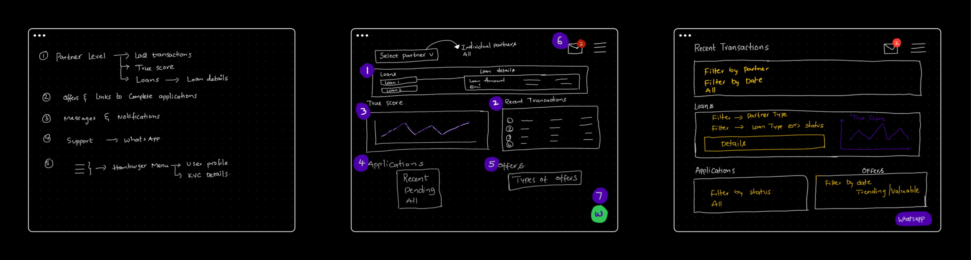
Below was the initial sketching done on features and layout ⬇️
Dashboard Iterations:
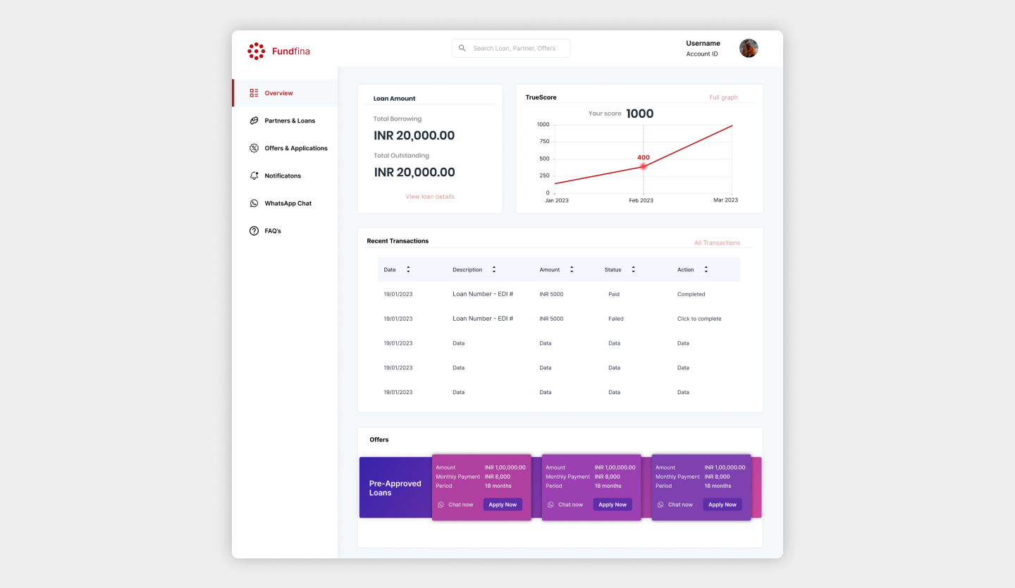
After few rounds of brainstorming, wireframing, and design iterations, we finally arrived at a sleek and user-friendly dashboard design for the web. It was a moment of accomplishment, a design that offered a seamless experience and made loan management a breeze for desktop users.
Mobile Design Challenge:
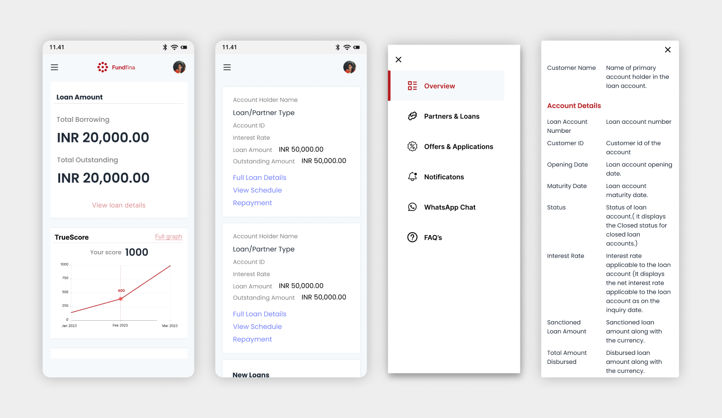
However, our joy was accompanied by a reality check when we turned our attention to the mobile platform. The dashboard design that had worked wonders on the web, unfortunately, did not seamlessly translate to the mobile environment. 📱
User-Centered Approach:
We realised it was time to regroup and re-evaluate our approach. We were committed to maintaining our user-centered focus, and we couldn't compromise on the mobile user experience. It was essential that our design catered to the unique needs and constraints of mobile users 🤝.
Mobile Optimisation:
This challenge served as an opportunity to put our creative problem-solving to the test. We rolled up our sleeves and embarked on the task of optimizing the dashboard design for mobile devices, ensuring that it not only looked good but also delivered a top-notch user experience.
New section
Recognizing that a substantial 89 percent of our users predominantly accessed our services via mobile devices, a pivotal decision was made. 📊 We shifted our focus to a mobile-centered design approach. It was evident that mobile users formed the backbone of our user base, and their needs and preferences had to take center stage.
Reversing the Paradigm:
This marked a paradigm shift in our design strategy. Rather than adapting a web design to mobile, we started with a fresh perspective. 🔄 We crafted a mobile experience that was intuitive, efficient, and tailored specifically to our users on smaller screens.
Mobile-First, Web-Next:
Our commitment to mobile users was unwavering. We firmly believed that if we could ace the mobile design, scaling it to the web would be a smoother process. It was a strategy that made sense in the context of our user base and their preferences.
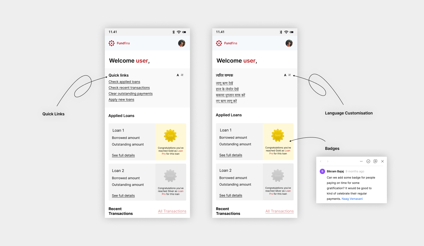
Quick Links for Easy Access:
To enhance the user experience, we introduced a "Quick Links" feature, providing users with easy and instant access to their most critical tasks. Users could now swiftly navigate to essential functions, such as viewing loan details, making payments, or checking their payment history. This feature not only streamlined the user journey but also minimised the time required to complete essential tasks.
Language Change for Accessibility:
We are passionate about making our services accessible to a diverse user base. Recognising the importance of accessibility, we introduced a language change feature. Users could now effortlessly switch between languages, ensuring that our app was inclusive for speakers of multiple languages. This feature demonstrated our commitment to inclusivity and improved the overall user experience.
Badges as Gamification:
To inject an element of fun and motivation into the app, we implemented a gamification feature using badges. Users would earn badges for various achievements, such as making on-time payments, successfully completing loan applications, or referring friends. These badges not only added a touch of playfulness to the app but also encouraged users to engage more actively with our services.
Performance Metrics:
-
User Engagement: User engagement saw a notable uptick with the introduction of the gamification feature. On average, users spent 20% more time within the app, exploring various features and earning badges.
-
On-Time Payments: The "Quick Links" and improved user experience contributed to a 15% increase in on-time payments.
-
Customer Satisfaction: Post-implementation, customer satisfaction scores reached an all-time high. Users reported a 25% increase in overall satisfaction, with many attributing it to the enhanced ease of use and accessibility.
-
Conversion Rates: The optimized mobile app experienced a remarkable 12% increase in conversion rates. More users completed loan applications and payments, leading to a tangible increase in the company's revenue.
-
Error Reduction: The mobile-optimized app witnessed a 30% reduction in user-reported errors and issues. This reflected a smoother user experience and significantly decreased support requests.
-
Mobile vs. Web Usage: In a telling statistic, mobile app usage overtook web usage, with mobile accounting for 70% of all user interactions. This statistic further validated our "mobile-first" approach.